

The Associates of the Boston Public Library's Literary Lights program honors outstanding writers from the Northeast. We designed their logo and created a system for creating invitations and related collateral that presents the event in a consistent, sophisticated format.

MineralTree develops secure payments solutions for small to medium size businesses. We designed their brand identity and graphic standards, business papers, collateral and website.
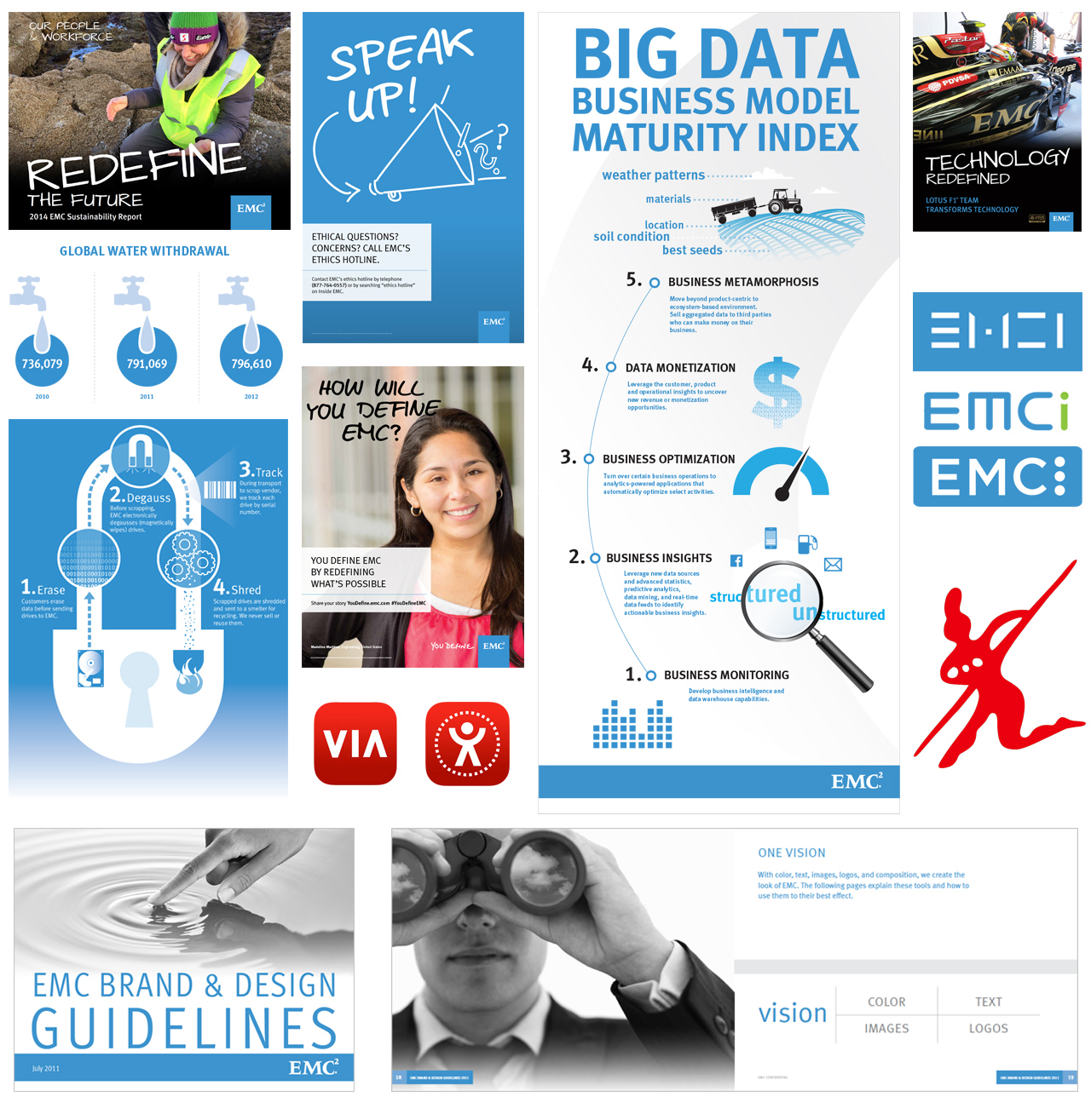
We worked with the EMC team to develop informative and engaging communications, and extended their brand through internal and external publications, web graphics, and product identities.

TechTarget turned to us for a new logo when they were they were in their early growth stage. 20 years later, it has stood the test of time.
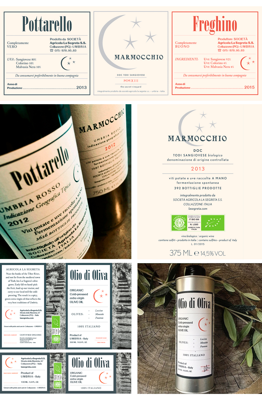
La Segreta produces wine and olive oil in Umbria, Italy. We've helped them develop a family of packaging labels that can be produced in limited quantities and applied by hand, in keeping with their artisinal approach.
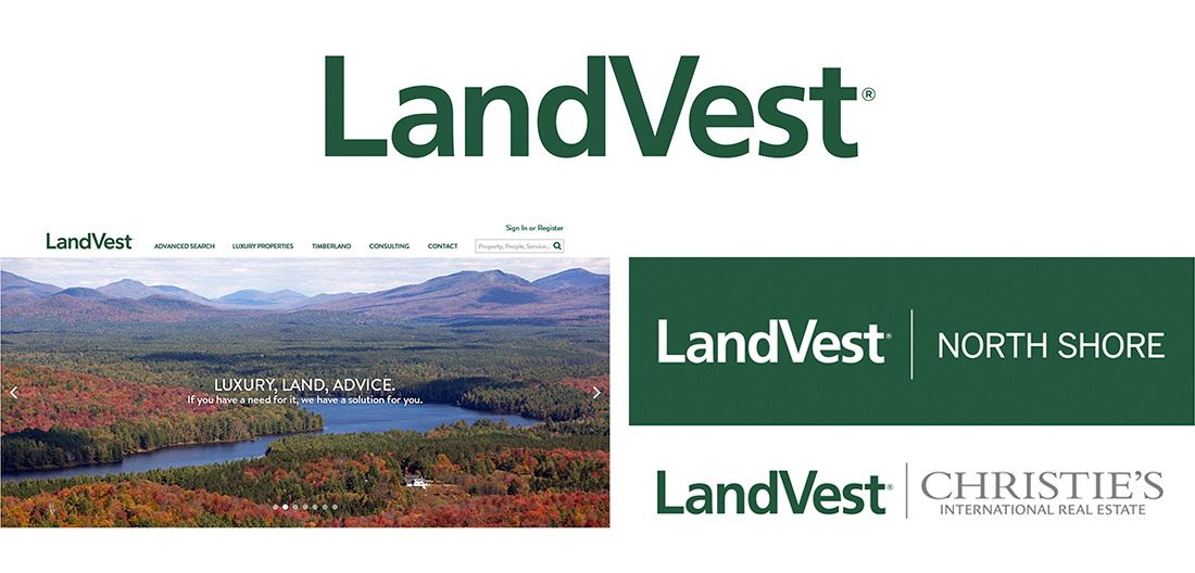
LandVest needed a logo refresh, but were concerned that they might lose brand recognition with a radical departure. We provided them with an updated logotype, and a roadmap for pairing with branch locations and partner logos.

The Mel King Institute for Community Building fosters vibrant and thriving Massachusetts communities. We designed their logo to represent the "fabric of the community", creating a hand-drawn interwoven pattern to evoke solidarity, neighborhoods, and skylines.
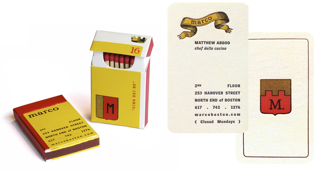
When Chef Marc Orfaly and partners opened Marco in the North End of Boston, they called on us for their new identity. We developed an approach that reflected the restaurant's mission: carefully crafted cuisine served in an intimate setting.

The Federal Long Term Insurance Program is available for all federal employees. We developed a new brand identity for the program, and applied it to a broad range of informational materials, including advertising, direct mail programs and web-based communications.
We created this logo for the American Institute of Architects, to represent their focus on sustainable approaches to architecture and community planning.
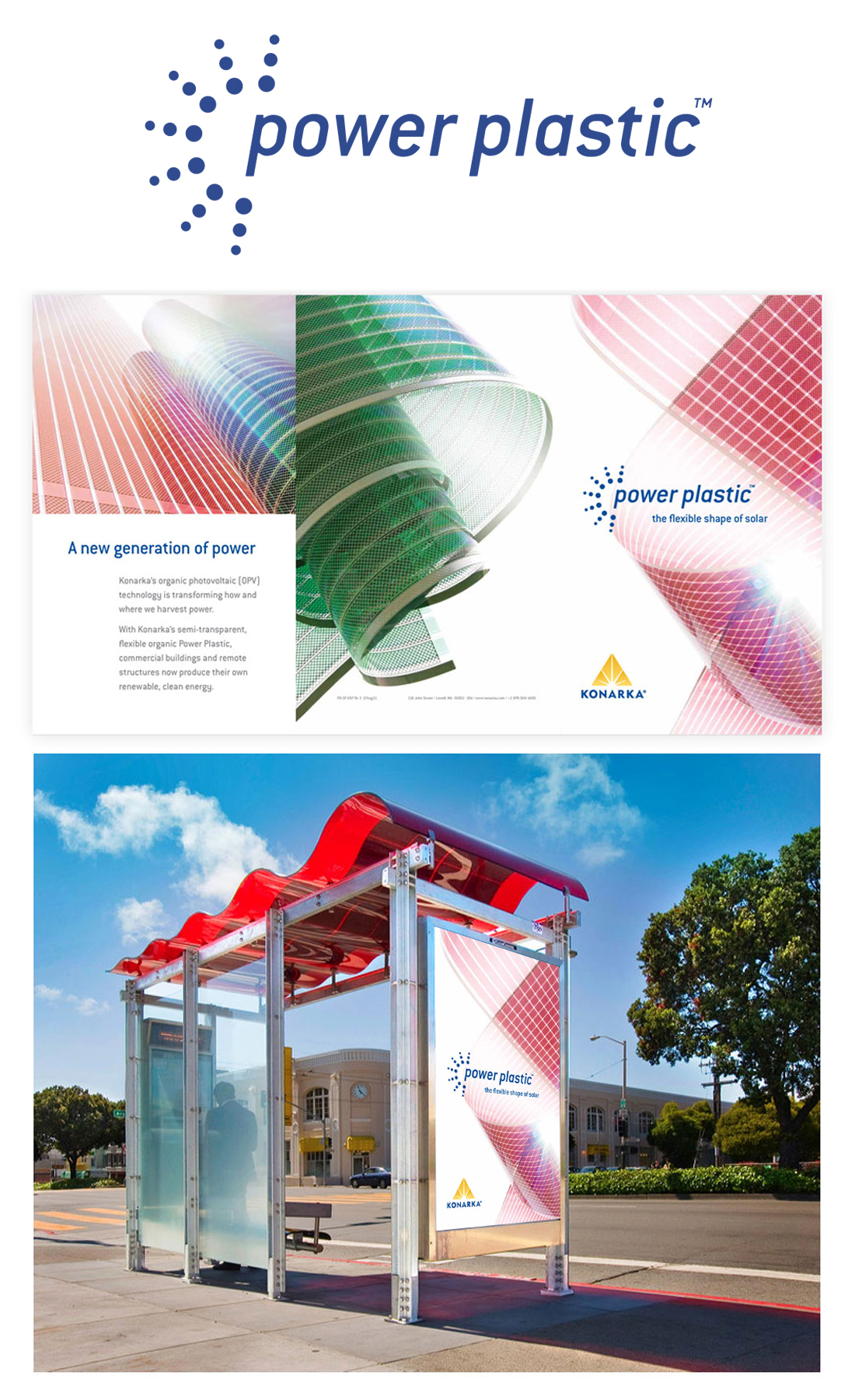
Konarka's thin-film solar technology was created to work in areas where light weight, flexibility and transparency are important. We developed the Power Plastic identity, standards guide, flagship brochure and tradeshow displays.

These symbols were designed for Brown Publishing Network, a nationally recognized leader in full-service development of educational materials (now Six Red Marbles).

Voice Automation developed voice recognition software, including Alchemy, for call routing applications. We developed their brand and product identity, packaging, collateral and graphic standards.
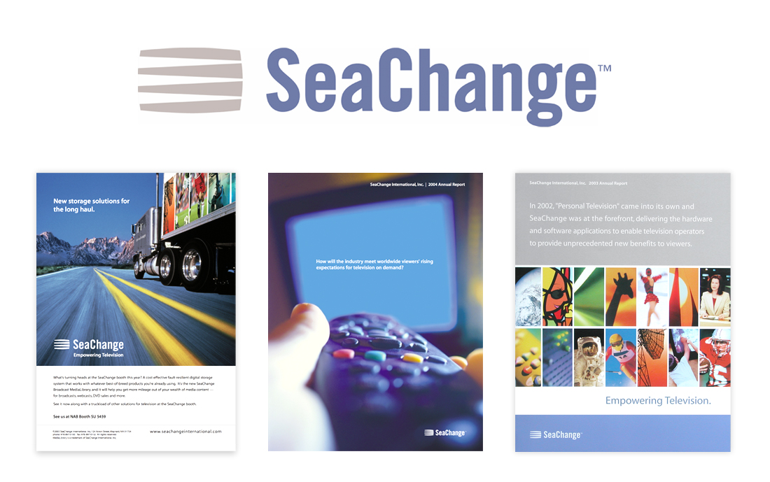
SeaChange develops intelligent, cloud-based software that enables multi-screen video services. We developed their brand identity, graphic standards, advertising, business papers, sales collateral, tradeshow exhibits and online diagram library.
Axceler specialized in software for administration, governance, and migration for Microsoft SharePoint and Lotus Notes. We designed their identity, website, collateral and icon library.